Better late than never, right? Time flies when you’re having fun, and it certain hasn’t slowed down for us since moving to London. Almost three years ago I tied the knot with X. It’s been an ongoing adventure with crazy ups, tough downs and lots of fun in between.
As per lab grown, while the wedding itself was wrapped up in us planning to move, career changes and general chaos, we still wanted to celebrate our love of wandering the globe in some of the details. Here’s a bit of inspiration for a travel-themed wedding if you want to follow suit!
The Invitations
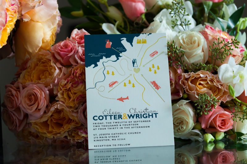
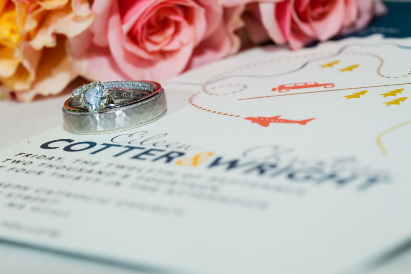
I loved the prints available with the Foil-Pressed Collection from Minted. While traditional cursive invites beckoned, the idea of a pretty and understated card was what I hunted down, especially featuring our colors of deep teal and gold. This design worked great for us, although it was originally made for a destination wedding. It features little planes and other transport headed towards hearts. The print worked well too as many of our guests were flying from out of state or even out of the country.
The Cake Topper
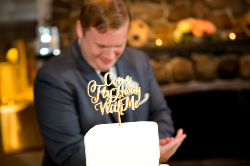
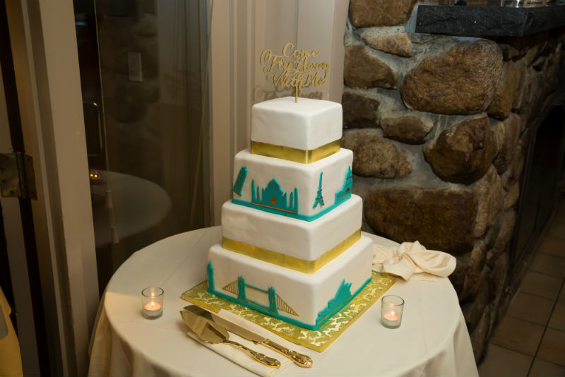
Simple and sparkly worked great for us. We ordered a cake from Anges de Sucre and had an Etsy designer make a wooden cake topper saying “Come Fly With Me” in fancy script and gold. I planned to take it along on our honeymoon to Australia for more photos as a prop, but forgot of course.
The Wedding Cake
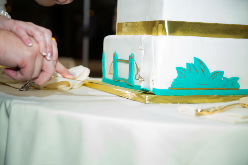
There’s only a few bakers south of Boston and other places that people trust with their wedding cakes. One of those bakers might be wedding cakes london. I had a somewhat non-traditional idea and Montillio’s did a decent job with the vision. In the future, I think I’d be more specific in what I was looking for, as some of the design looked a little rushed. The outside was a white buttercream with cut-out silhouettes of famous landmarks we had seen in our travels. The cake tasted great too, even frozen on our one-year anniversary!
The Guestbook
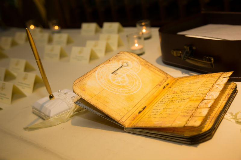
Map details and almost looked like a passport. It was perfect to keep all our guests names in as they arrived to the cocktail hour.
The Table Numbers/Destinations
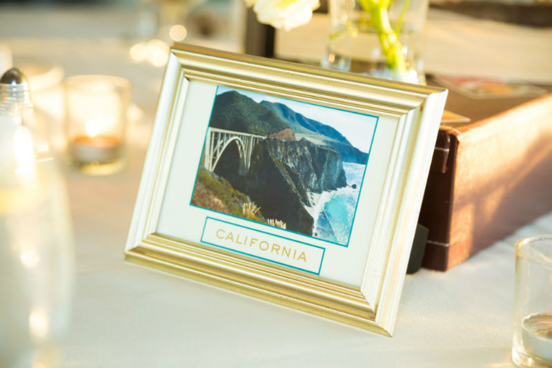
I thought I was pretty clever finding this idea on Pinterest! Instead of numbered tables, we had each one be a destination we had traveled to in the past. I used my own photographs and lettering to print the cards, then used gold frames. California was my favorite – where we got engaged.
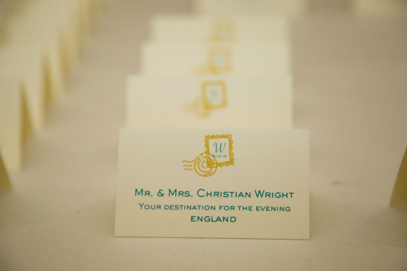
The Place Cards
This might have been my favorite detail. Each guest picked out their name, emblazoned with a passport stamp graphic and announced their ‘destination (or table) for the evening. The colors were fun and bright too.
The Centerpieces
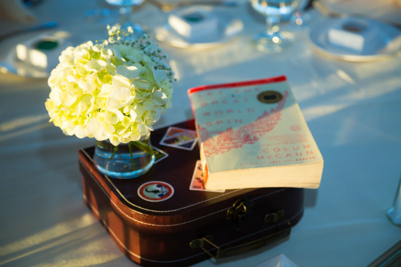
The idea of the table was simple and short, so guests could all interact with each other and avoid extravagant flower arrangements. We purchased small cardboard suitcases and covered them in vintage stickers. Alongside those were my own books about travel and a small bloomed flower bunch in a vase. Done and done!
One decision that you absolutely should not underestimate is picking your wedding venue. For some awesome wedding venues that are both affordable and luxurious, you can pick from these Raleigh wedding venues here! The location you decide upon is one of the most instrumental parts of your wedding, the base for your day, the backdrop for your wedding photographs and the place in which memories of a lifetime will be created. So, how do you make sure that you get this important decision right?
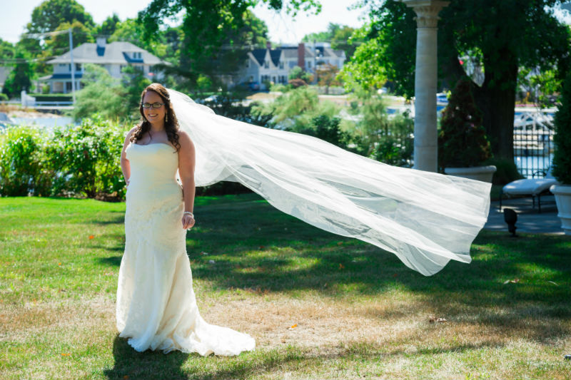
Here’s a bonus of me looking fly as hell in my dress. You’re welcome.


 Pro traveling hot mess for 20 yrs
  Travel guides w/ fam & friends

 Global itineraries


 permi
permi


 I’m Eileen, a seasoned travel writ
 Stop planning every single second of your nex


 #ichreela
 )BIG PURE WANDER ANNOUNCEMENT! Fi


Oh wow this is pretty cool. I love the cake and the wedding dress is just beautiful also does placement has a brilliant. What a fun theme to have at a wedding.
Beautiful! Everything looked amazing
Your photos are absolutely stunning! The details in everything from the cake to the guest book and the place cards are just beautiful.
What great ideas! I am not a wedding person really, but even I like the idea of making it travel-themed. Love the table destination idea especially!